
Strategies for visualizing diverse qualitative data
Have you been overwhelmed when faced with a lot of different types of information that you need to visualize in one place? Confused on where to start? I recently worked through something like this while designing journey maps, and would like to go through some of my process and share thoughts on how to simplify groups of information that are very complex. Hopefully some of this will be helpful!
What is journey mapping?
Journey maps take a close look at client, user or customer experience paths to a goal. This could be a journey through a digital app, physical store, hospital, or other type of experience. Journey maps capture the thoughts, actions and feelings of the person experiencing the journey, and visualize the path they take physically, logically and emotionally.
Journey maps are the culmination of extensive research and interviews with users, clients or customers. A large body of qualitative data is developed. This data is extremely useful to learn about their experiences, but it’s an overwhelming amount of content. The research needs to be combed through and organized to see the patterns that develop.
For some background on journey maps:
A Beginner’s Guide To User Journey Mapping
Using Customer Journey Maps to Improve Customer Experience
Getting Started
At the start, you have a lot of undifferentiated qualitative data, obtained from in-depth interviews with users, clients or customers.
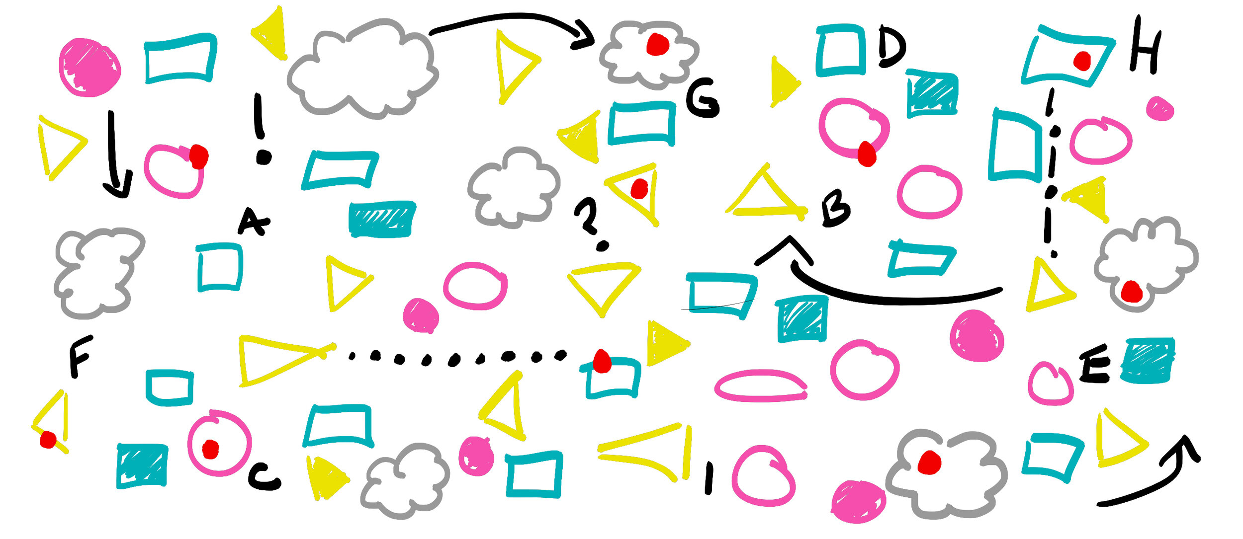
To help the patterns emerge, it makes sense to group the information you have into types. Some common categories include:

An important question to ask—how will your audience access this information? This will inform the density of information that you show, and how you will choose to display it. In general, the longer your audience has to sit with and interpret the information, the more information you can add.
For instance, if you are displaying this information during a live presentation, you won’t have time to show the level of detail you would if the viewer could take their time to review the data. If you are running a live presentation, you will need to pinpoint only the top level takeaways, and move the details to an asynchronous venue (print or PDF leave behind). For the journey maps I worked on, we decided to create PDF takeaways that could be read on-screen or printed as a large format document. This gave us the opportunity to include a lot of the details to support the story.

Once you have grouped your data by type, you can look through what you have, and begin to structure the story. What are the high points? Low points? Is there a pivotal moment in the experience? Highlight these. Grab some sticky notes and write out the top level points of your journey, so you and your team can agree on whether or not this data is clearly telling an accurate and compelling story.

Once you have these high-level notes, look at the rest of your data, to see which information fits where. Some may be redundant or erroneous. Removing that information will simplify, allowing you to just focus on the strongest pieces for each section.

Once you are feeling solid with your story arc and content focus, you can ask more design-related questions that are independent of the specific journey content.
What size canvas?
If the assumption is that your audience will be viewing on-screen, it would make sense to set up a horizontal document. You may also decide that your optimum viewing environment is on a laptop (vs. tablet or phone) if you are including a lot of details in your journey.
Divide your canvas into sections by content type
To get organized, try placing your content into zones for each content type. You don’t have to stick with this, but it’s a great way to get started, and get a sense of the amount of content you have. It might become obvious that you still need to reduce. Remember that if you try to shoehorn too much into your canvas, you risk losing your viewer if they become overwhelmed.

What about text style and size?
To start, set all of your text to the same size. If you find you are making text tiny so that it can fit, you probably need to edit down your story content even more. As you design your sections, you can bring in different type sizes and styles, but keep a logic to your variations, and limit the number of variations to give your canvas a more professional and clean look. Consider using one font style for headers and standalone pieces of information, and another for paragraphs or descriptive copy.
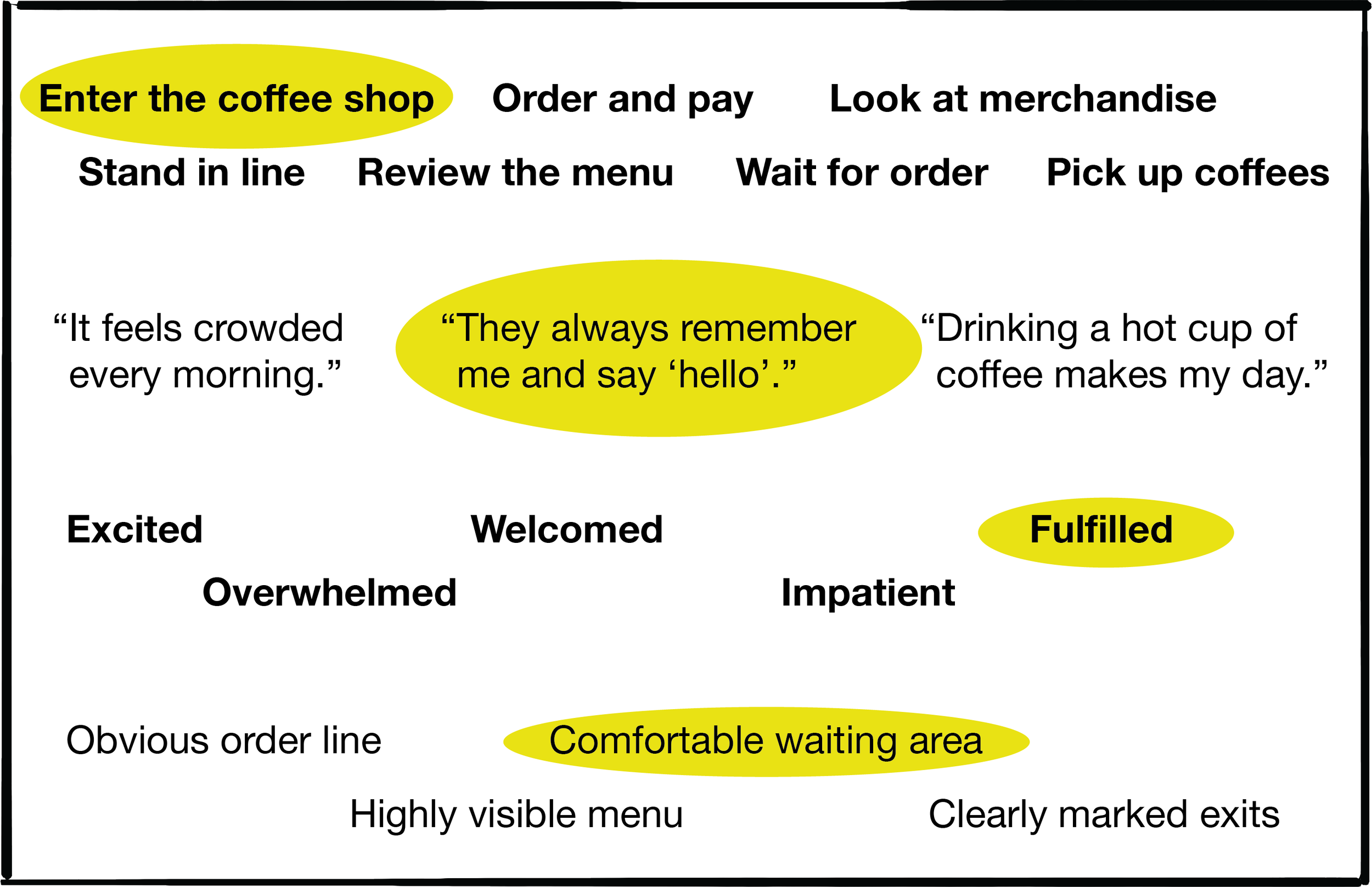
The following are sample “journeys” through a local coffee shop.
Avoid: “dog’s breakfast” of too many font sizes and styles. Your eyes go all over the place to take in the information.

Instead: Minimal variation. Not very “exciting” yet, but at least you can read it!

What about color?
As with font styling, keeping color minimal and purposeful will help keep the canvas looking professional. That doesn’t mean it needs to be boring! Use color to your advantage by selecting one color that will “pop”, and draw viewers to particular areas of the journey. Don’t overdo it—if you’re disciplined and use your pop color at the most important parts of your story, that will reinforce your takeaway. Conversely, if you have lots of colors in an arbitrary fashion, the viewer won’t know what’s most important, and might miss what you’re trying to explain.
Avoid: Using multiple accent colors can dilute the story. Emphasize many things, and you may end up emphasizing nothing.

Instead: Limited palette. You can create immediately obvious hierarchies that will help to tell the story.
Also, remember that colors have connotations. Red can indicate a warning, or negative piece of information, where blue or green could be seen as neutral or positive.

Structure
If possible, keep your content on a grid. This helps calm the eye when taking in a lot of content at once. It also will help to group types of content together. A grid can allow you to cleanly integrate the maximum amount of information.

Make it fun
What’s the emotion behind this journey? Are you able to show it with color, language, or maybe imagery or illustration? If there’s a shorter, more impactful way to state the actions, emotions and factors, see how you can maximize that effect. Maybe you can use color to broadcast what the emotion of a journey is at a particular point. Finding ways to illustrate the emotions of the journey will go a long way to connecting with your audience.

Conclusion
Journey maps are complex documents that, if set up properly, can tell a compelling story and answer a lot of questions about how users, clients or customers experience your product or service. Following some basic guidelines will help you present this information in a way that helps get buy-in from your audience or team on how to proceed based on qualitative data findings.
If you’d like to see an example of a journey map that I worked on, please visit my case study: Digital Innovation Journey Maps
For additional information about what journey maps are and how they are used, check out these links:
Thanks for reading!