
The Universal Language of Visualization
A conversation with data visualization expert, author, and teacher, Alberto Cairo
Alberto Cairo designs visualizations, consults on visualization with companies and institutions, teaches Visual Journalism at the University of Miami, and is the author of three books on data visualization, including his latest, How Charts Lie.
Note: This interview has been edited for length and clarity

Are the books you have written starting the conversations that you're hoping for? What kind of impact do you see after they come out?
I think that they do. I wrote them because I really care about people understanding visualization correctly, and also spreading the word about visualization being a potentially universal language that anybody can adopt and use. That’s the idea that I tried to push, for example, in my second book, The Truthful Art, and that really picked up. I’ve seen the book being adopted in programs of different types. Journalism for instance, but also surprisingly data science programs adopted the book. And in journalism programs, it has been useful because it shows that there is another way to communicate, not only words spoken or written, but also visual representations of information.
In the case of How Charts Lie, that’s a little bit more difficult to assess because How Charts Lie is not an academic textbook like The Truthful Art sort of is, although I didn’t write it with that intention, but it became a textbook. How Charts Lie is essentially a book for the general public. But it seems to be doing well, it’s selling nicely, and it seems that people are liking it. The reviews are very, very positive in general. And the reviews that are being posted in places such as Amazon highlight exactly what I wanted to address. There were reviewers who were saying, “I thought that I knew how to read a graphic correctly and I still learned something useful from this book.” So that’s the best assessment of the book or at least of the intentions of the book, I think.
“...I really care about people understanding visualization correctly, and also spreading the word about visualization being a potentially universal language that anybody can adopt and use. ”
Hear about upcoming conversations:
What are ways that people can encourage critical thinking when audiences are interacting with their work?
With the visualizations that they create. So on one hand, the book does help with that. I have evidence that after reading How Charts Lie, people usually say, “I will never look at visualization in the same way,” which is again, the purpose of the book, to prove and demonstrate that visualization is not something that can be just looked at, it needs to be read in order to be understood. But there are ways in which designers can prompt a similar reaction on the part of the readers, which is, for example, to never assume that a visualization will be understood at a quick glance. Always add annotations to your visualization. If the visualization is intended to communicate, try to write a good title, try to write a good introduction, try to write annotations on the visualization itself that point out the main points that you’re trying to make.
And that may prompt, I think, more attention on the part of the reader. “Hey, take a look at this, read it carefully. Take a look at that. Don’t miss this point.” Those kinds of tricks, emphasis, highlights, annotations, I think that come prompt or can encourage a slower reading of the chart. Rather than rushing to conclusions, by reading the chart it prompts people to read the chart more carefully and slower.

Although I assume you have to balance that with not adding too much, defining what’s necessary and what’s extra.
That’s correct, because if you add a lot of text to a visualization, it defeats the purpose of the visualization, which is to present the information visually. But if the addition of a little bit of text here and there doesn’t clutter the visualization, I usually encourage people to think about the words that you can write about the visualization that you are making.
You mentioned something about clarity over simplicity.
Yes. That’s a notion that I usually explain, the difference between simplification and clarification. This is not something that I invented myself. I borrowed all these discussions from Nigel Holmes, who is a long time infographics designer. And for many, many years, Nigel has been saying, and I agree, the purpose of information graphics or explanation graphics is not to simplify. It is to clarify, which is different, because when we think about simplification, we usually think about the reduction of information, removing detail. So the main story will arise and be visible to the reader. And that’s a noble goal. I don’t think that we should overcomplicate our graphics.
“We need to find a balance whenever we are designing a visualization between showing too much, overcomplicating, or showing too little, which will be oversimplifying.”
However, when we only think in terms of simplification, it is very easy to go way beyond what would be acceptable, and then oversimplifying a story. We need to find a balance whenever we are designing a visualization between showing too much, overcomplicating, or showing too little, which will be oversimplifying. And that’s what we mean by clarification, that trying to find the sweet spot between those two extremes may help our reader figure out what’s going on by providing a sufficient amount of detail, a sufficient amount of information.
So then you need to have a general notion of who is viewing your visualization?
You need to make a lot of guesses. You need to understand the information that you’re presenting really well, so you can find out or figure out what level of detail you need to convey the ideas that you want to convey. But also you need to have some informed guesses of who the audience is going to be, and how much they know about the topic that you are visualizing, because obviously the less your audience knows about the topic, the more information that you need to provide so they can figure out what is going on with the chart.
In the case of journalism, with increased ability to create graphs and charts, do you think those advancements have overall helped? Or are there pitfalls there?
Indeed there has been an explosion in the use of visualization in journalism, in the past decade or decade and a half. Graphics departments at lead media publications have increased in size quite significantly. And the presence of data visualization in news media has also expanded, which I think is great. I think that that’s a positive development. I think that it is good that journalists are becoming more and more aware that these types of graphics might be useful to tell stories, explain things. It’s not just text, it’s not just words. We can also use graphical presentations of information. So that is positive, obviously. On the other hand, there are opportunities for misusing graphics or creating graphics that can be easily misinterpreted. And we’ve seen examples of that during the pandemic, particularly at the very beginning of the COVID pandemic, cases of misuse of data visualizations, perhaps with the best of intentions, but graphics that ended up misleading the public a little bit, in my opinion. So there is an opportunity for that as well.
But overall I think that is a very positive development. I wish actually that more journalists, and not only journalists, more communicators in general, will adopt and embrace the language, not only of data visualization, but the language more broadly of information design, the visual presentation of information, which is not only data visualization. Data visualization is just one of the branches of the information at this time.

Here in the U.S., I feel like there’s been a highlighting of these misleading charts, around data dealing with the pandemic, and many other subjects as well. Do you see the same discord over misinformation in Europe?
I think that it’s a universal challenge. I don’t think that it is something limited to the United States. For example, I lived several years in Brazil and Brazil is dealing with a huge misinformation problem right now, tons of new obscure news outlets appearing out of and spreading misinformation. It’s a huge problem. It’s also a problem in Spain. Any country that I’m familiar with is facing a similar problem regarding misinformation. So I don’t think that the United States is particularly different to other countries, maybe in terms of the scale, just because the United States is such a wealthy, big, highly populated country that we notice misinformation more than other countries, but it’s certainly not something specific of the United States.
But as you said, it’s not a new phenomenon. It’s only that due to technological advances, it has become easier and easier to spread misinformation, but on the other hand, it has also become easier and easier to spread actual good information. So what we need to do societally is to figure out how to deal with the problem and at the same time, taking advantage of all the opportunities that technology puts in our hands. How do you do that? I don’t know. I’m not an expert on that, on how to control misinformation, but I’m excited about the possibilities of technology. I think that in general, technologies of communication and more in particular technologies of visualization are a good thing to have, and it is good that they have become more popular, they have become free in many cases and people are using them more and more.
Have you seen, either in your own personal life or just in the population in general, the results of a data revelation that caused a change in behavior either in you or others?
Yeah, sure. Just during the pandemic. Some of the most popular content ever published by some U.S. newspapers such as the Washington Post have been data visualizations related to the pandemic recently. The most popular story ever published by the Washington Post was a visualization story about the pandemic that showed about pandemics in general, that visualized what happens in a population when a country takes measures to contain a pandemic or doesn’t take measures to contain a pandemic. It does that through visualizations. El País published a story about how viruses spread in close, small spaces. And they visualized that through illustrations and data visualizations. And very quickly that story again, became the most popular story ever published by El País, the most important newspaper of my country of origin, Spain.
Just think about the flatten the curve graphic. The flatten the curve graphic, did that graphic change minds? Maybe not, but it helped people think about the problem differently. How quickly a pandemic spreads in the way that it might overwhelm the health services and resources of a country if we don’t contain it. Whereas we contain it, then the curve will be flattened. We will still have a lot of cases, but they will be spread over a longer period of time in a way that doesn’t overwhelm our hospitals, in a way that we can save those people because we will be able to provide good care. So I think that all of these examples, particularly the flatten the curve graphic are examples of graphics that might have the potential to change minds.
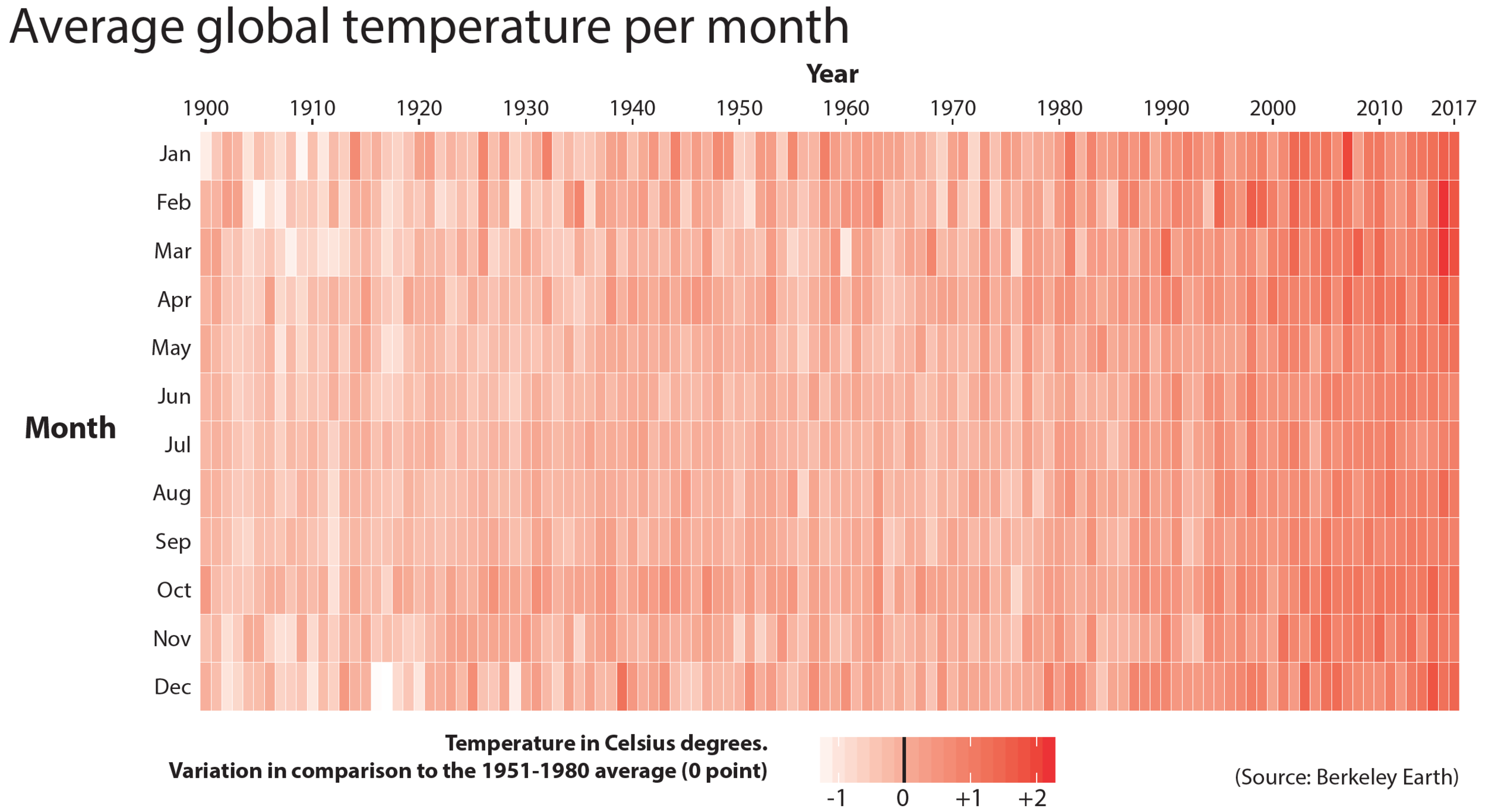
There are plenty of other examples. For instance, in my second book, The Truthful Art, I describe the hockey stick chart, which is a chart depicting the average temperature of the world in the last 1,000 years. And it’s dramatic. You can see temperature varying slightly for 900 years, and then of the past 100 years, global temperatures are spiking very rapidly in an abnormal way. And once you see that chart, it’s very memorable. You cannot un-see it anymore. It’s very, very memorable.

When you’re helping clients with this sort of work, do you have any challenges? What’s the most difficult thing for you to explain about what you do and how you can help them?
It’s not that there is anything particularly difficult. I try to make my classes as fun and as engaging as possible. So I never found a huge difficulty. However, I need to defeat some resistances. For instance, when I teach data visualization, many people, when having a discussion about graphics, usually precede their comments during a discussion, saying, “I am not a designer, but...” and I say, “Well, neither am I. I’m not a designer. I am a designer, but I’m not a designer in the sense that I have a diploma in design. The same way that I am a writer, but I don’t have a diploma in writing. If you design, you are a designer, that’s the very definition of a designer, someone who designs. The same thing that if you write systematically on a regular basis, you are a writer. You are a writer.”
“This stuff is not magic. If I can learn, you can learn and I’m going to teach you how, and I’m going to show you how. It will require a lot of effort on your part. It will require years of practice on your part, reading, studying, making mistakes, getting those mistakes corrected, but this stuff is not magic.”
So I try to change the way people think about visualization in the sense that I teach them... It’s a similar resistance that I need to defeat in my own classes, beginning of the semester by saying, “You might have seen all these beautiful visualizations in the New York Times and the Washington Post and immediately think, ‘I will never be able to create anything like that because I am not a designer.’” I begin my classes saying, “This stuff is not magic. If I can learn, you can learn and I’m going to teach you how, and I’m going to show you how. It will require a lot of effort on your part. It will require years of practice on your part, reading, studying, making mistakes, getting those mistakes corrected, but this stuff is not magic.”
The same way that anybody can learn how to write well, you might not become an Ursula Le Guin or a Philip Roth, a top writer, but you can learn how to write decently well if you practice. Same thing with design, you will not become Leonardo da Vinci, but you don’t need to. You just need to be good enough to create graphics that are clear and informative. And that’s a craft. It’s a craft that can be learned and it’s a craft that can be taught, and it can be taught through the practice. So that’s a resistance that I need to defeat.
The main challenge I would say, not challenge, but it’s the core of my classes is that I try to help people develop a reasoning method when designing visualization. What I mean is that in visualization when making choices, for instance, about how to depict our data, it is very easy to work in autopilot. One experiment that I have made plenty of times is to give a group of beginners a data set in which everything adds up to 100%. And I ask them, “Please design a graphic.” And as you may guess, the graphic that appears most commonly in that case is a pie chart because the pie chart is the graphic that we most commonly associate with parts of a whole and percentages.
But then I demonstrate to them that the pie chart might be appropriate in some contexts, depending on what you want to communicate. But sometimes you may want to depict your data as a bar graph, just because what you want to do is not to see parts of a whole. What you want to do is to compare the numbers to each other. And in that case, the bar graph is a little bit better. So I try to help people develop their own reasoning process. How I should design this thing based on the resources that I have available, based on what I know how to do, and based on the audience that I’m communicating with, or the nature of the information that I’m presenting, all those are the considerations that we need to take into account when designing a graphic, and designing the graphic requires a reasoning process that can be developed.
“Visualizations are not meant to be just looked at or seen. They are meant to be read in order to be decoded correctly.”
Are students surprised by that? Because that’s not necessarily the design language they're expecting?
Yeah. What they realize is that doing information design and more specifically data visualization has many parallels to writing. It’s the result of a reasoning process. It is the result of the application of a particular vocabulary and a particular syntax, symbols, and the arrangement of those symbols. They realize that again, visualizations are not meant to be just looked at or seen. They are meant to be read in order to be decoded correctly. So the reaction that students usually give in my classes is, “I will never see visualization the same way. This class has changed my mind completely about all this.”
That’s awesome. And are your students becoming more savvy over time since you've been teaching?
I would not say that they have become more savvy. I think that my students have not changed that much in the past 15 or 20 years in the sense of how they get to my classes. They usually come with the same assumptions and the same expectations, and sometimes their expectations are met, sometimes their expectations change, but I have not seen huge differences in terms of how technologically savvy they are. It’s essentially the same thing.
They might be more familiar for example, with the visual language of video games perhaps today than they were 15 or 20 years ago, just because video games have become extremely visually sophisticated in the past 10 or 15 years, but it’s not a substantial change. That’s not a substantial change.
And do they catch on pretty quickly when you talk about things like misleading charts, are they open to and understanding those ideas?
Yeah, they are because they realize that it’s a language. In the same way that when you read a piece of text, you need to pay attention to it and try to decode it, something similar needs to be done with visualization. So yeah, they indeed embrace the ideas in the class, yes.
And how do you help them work in the human side of visualizations?
Different thoughts about that. First of all, I try to expose my students not only to traditional orthodox data visualization, which should be derived from the world of statistics and computer science, although that’s part of the core of my classes. I teach them principles of traditional visualization design, but I also expose them to the work of another type of visualization design association design that is a little bit more creative, a little bit more artistic. So I expose them to the work of data artists, and I show them how fun that process can be, how by using, for example, physical objects to represent data, or by using hand painting or hand drawings to represent data, you can create visualizations that look a little bit less accurate and a little bit less precise, but at the same time, by their irregularities and imperfections, they also look a little bit warmer, more approachable or friendlier because they don’t look as geometrical and perfect as they did before.
“I teach them principles of traditional visualization design, but I also expose them to the work of another type of visualization design association design that is a little bit more creative, a little bit more artistic. ”
So I show them plenty of examples of that. And then also, obviously I try to instill in them a sense that the visualization will not capture no matter what you do, the human experience behind the numbers. That’s something that cannot be done through the visualization. Visualizations exist to show patterns and trends in data. If you want to see the human side of the numbers that you’re representing, you need to do that by pairing the visualization with other languages, for example, video, photography, narrative texts and so on and so forth. So in my classes, I also discuss how to integrate all this language into cohesive, organically integrated narrative multimedia pieces, so to speak.
Who are the people that are go-tos for good examples of that?
There are so many great people nowadays. So it depends a lot on the type of visualization that we are talking about. In terms of news media, I follow all the usual suspects, anything from the New York Times, Washington Post down to, I don’t know, the Miami Herald. I’m here in Miami. They don’t do a lot of visualization nowadays, but they still do a little bit of it. Less well-known perhaps places such as ProPublica, which is an investigative reporting organization based in New York, they do extraordinary data and visualization work, but that is just in the United States. And I am from Spain so I also follow publications in Spain. I lived in Brazil, so I follow Folha De Sao Paolo, Estadão De Sao Paulo, which are the main newspapers in Sao Paulo, Brazil. There are so many people doing good work nowadays. It’s super, super hard to follow up everything that is going on everywhere.
And I also follow the work of people who are not necessarily, as I said before, related to the world specifically of data visualization, but also who are in places such as data art. I’m thinking about people such as Shirley Wu or Nadieh Bremer who can do both traditional data visualization, but they also do less traditional data visualization, things that are a little bit more visual arts. So Nadieh Bremer, Shirley Wu, Giorgia Lupi, for example, Mona Chalabi, people who try to push the boundaries of the field or push the envelope, try to create new ways of representing information graphically.
“ That’s one of the most exciting things about it, that this is a field that is very welcoming to newcomers.”
I think it’s an exciting time for that sort of thing. There’s so many tools out there to be able to do that.
So many tools, so many techniques, so many ways to show the information, and so much work to be done. That’s one of the most exciting things about it, that this is a field that is very welcoming to newcomers. If anybody’s interested in learning visualization, there are plenty of resources online that people can use, or even associations like the Data Visualization Society, which is a professional organization that is very welcoming to newcomers, to beginners. They have a very active Slack channel and they have their own publication and tons of people who are willing to help and give advice. It’s a great community to be in.
What’s the next big thing that you’re working on?
I’m supposed to be working on a book. That’s what I’m supposed to be doing, just because I need to finish writing it before February of 2022 so it can be published in the middle of next year. So yes, indeed. I’m working on a new book. I usually joke that it would probably be my last one about data visualization. Probably I will run out of ideas to write about after this one. Maybe not, maybe I can come up with something new, but I will really like to write about other things, not only data visualization.
In any case, it’s a book about data visualization, but it’s more about, how do you describe it? It’s not about the technology, it’s not about the means of production, so to speak or the techniques that people use. It’s more about the values. What are the values that push people to get into this field? What gets you excited? So I’m going to base it in a series of conversations with several visualization designers from all over the world. What brought you to this field? What keeps you excited? What are the values behind your work and how those values inform your process, the way that you do things, the way that you present information?
I would probably precede all these conversations with a long interaction in which I will lay out the way that I do things and the values that I have, always making clear that I don’t assume that these are universal values, or a universal way of doing things. It’s just my way of doing things. So it’s going to be probably my most personal book in that sense, I would say. It’s a book that is going to combine ethics with values and things like that. I may insert a little bit of my interest in the philosophy of morality and ethics, because that’s one of the fields that I’m most interested in, but I will do it in a non-academic way. All my books are very non-academic. So I want a book that can be read essentially by anybody.
I have tons of notes and I already have something written out, but now what I need to do is essentially just force myself to sit down in the second half of the summer, and just to start typing for three, four months straight, and then copy edit. That’s the way that I usually write books. I wrote How Charts Lie in two or three months. The editing process took much longer than that, obviously, because writing is not just writing. The first thing that you write is usually complete crap. You only get a good book after editing it. So this one is not going to be different. I will probably write between August and I would say October, November, or something like that. And then I will devote the rest of the time until mid next year, just editing the book.
It’s daunting, yeah. When you think about it. “Oh, I need to write 200 pages, 300 pages.” But the way that I write books is set up small goals, short-term goals for myself. So I usually impose myself a discipline of say five pages per week. No matter what, I need to write five pages this week, even if it is complete crap, even if it is unreadable, I need to write it. I can go back to it.
It is not a quality thing. It’s essentially just force yourself to write something, no matter how bad it is, do it. You can always return to that. But if you wait until the news passes over you and you get inspired to write something, you will never get anything done. You need to force yourself to do it.
I feel like that's the thing about writing and a lot of things. You just have to do it.
It’s about anything. You just need to get the job done and do it. Just sit your ass down and get it done. That’s what you need to do.
I think editing is really important as well.
Yeah, editing. And that’s the worst part of the job. It’s the most necessary part of the job, but it’s also the type of job that I don’t look forward to. I really don’t like to edit my own work, but it’s a necessary part of the process.
It's like working out. Nobody likes to do it while they're doing it.
Thats how it works. There are people who enjoy having their muscles strained and the effort and push themselves. I experience a little bit of that for example, with swimming. I like to swim and I like to push myself, but certainly not to the levels of some friends of mine who are almost professional athletes. I never look forward to my daily workout. If I could avoid it, I will avoid probably.
But you’re just so much happier afterwards, right?
Exactly.
To learn more about Alberto Cairo, visit