
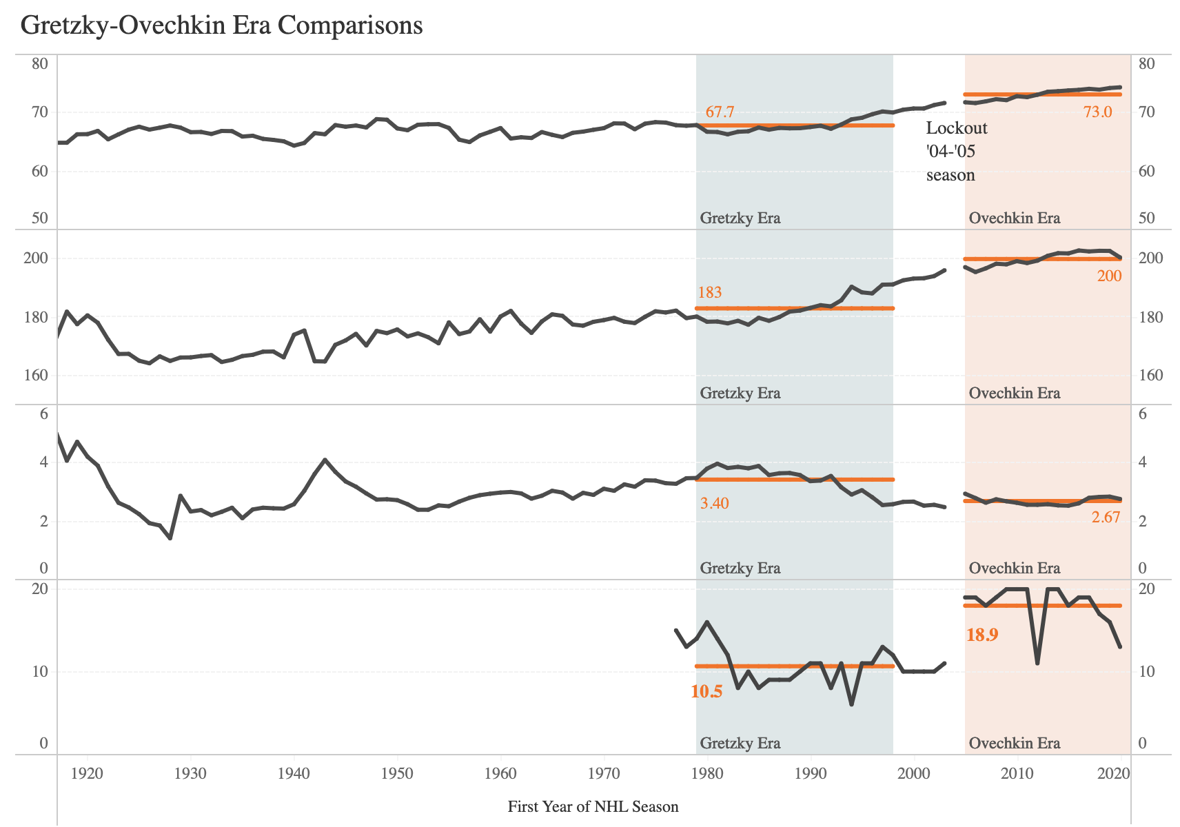
Explore Your Visualization Options
A conversation with Jon Schwabish of PolicyViz
Jon is an economist, speaker, author, professor, and founder of PolicyViz, which helps organizations better communicate their research, analysis, and ideas. He recently published his third book, Better Data Visualizations: A Guide for Scholars, Researchers, and Wonks.

You are very generous with the amount of helpful content you share with the dataviz community. What is your strategy for generating the amount of content that you do?
I would say a few things. One is that it’s hard to figure out the channel to get to people. Some people are going to read, some people are going to listen, some people are going to watch video. It's hard to know.
I was talking to someone the other day about my podcast and their first question was, “Why do you do your podcast? What is the point?” For me, the point is giving back to the community and elevating other voices. It’s not about generating revenue or gaining customers—it’s about highlighting voices in the field. It also helps that I have a very supportive and flexible family and job at the Urban Institute. It affords me the freedom to do a lot of this kind of work.
I also work with a couple of people to help shoulder some of the technical stuff—sound editing, for example, or getting YouTube videos edited and posted.
“For me, the point is giving back to the community and highlighting other voices.”
Hear about upcoming conversations:
Your content straddles strategic with hands-on tutorial style writing. Are you still directly building most of your visualizations? Is it challenging to keep up with newer graphing technologies?
A little bit, yeah. I like using new tools, but Excel is where I’m an expert. With the introduction of tools like D3, ggplot in R, and Flourish, people have been able to make amazing visualizations. From my perspective, what’s interesting is the challenge of creating those visualizations in Excel. A lot of people in my professional network are economists and people working in public policy who, for the most part, are using the Microsoft Office suite.
When I think about my audience and my network, I picture the nonprofit organization that consists of six people and one of them is the data person for the organization, who is also the communications person, who is also the media person, and so on. It’s just one person doing everything, all with a limited budget. Can I help them build some of these more engaging graphs that are outside that Excel dropdown menu? So many people see great graphs on the New York Times or Washington Post websites, and say, “I could never make that. I don’t have the coding chops.” And while that’s often true, I would say, “Well, really that’s just a dot plot, and I know it’s interactive, but we don’t need interactivity in this particular case, so let me help you just make a dot plot. And we can do that in Excel, which you already have.”

From the PolicyViz Blog: Lego World Map Excel Edition
Why did you start PolicyViz?
First off, kudos to my wife, who comes up with the names for everything, including PolicyViz. I founded it when I was working at the Congressional Budget Office. I was working on data visualizations and getting asked to teach some workshops. As a government employee, teaching is fine at an accredited university, but then I started getting requests for private client work, so I had to make a hard decision. But I also wanted to keep doing economic research, so I moved to the Urban Institute, where I was able to do both—continue my research and do consulting work in the data visualization space.
More generally, the challenges involved in communicating budget estimates and social science research more generally, were areas where I thought I could add to the conversation, and needed a place to do that. Originally, PolicyViz was just a blog, then I added a podcast, data visualization catalog, my HelpMeViz project, and more.
“People want different information to do different things with: to make different discoveries and implement different recommendations.”
What concept about visualization has been the most challenging for your audiences to understand?
I think the challenge has been convincing researchers that not every detail, subtlety, and nuance of the work is equally important. Especially if you want your work to be utilized by policy makers, be it federal, local or state, or by stakeholders; whoever it is. The model that the Urban team built is not about dumbing things down, but instead it’s about thinking carefully about who is using different platforms and how we get information to those people.
We have a model in the Elevate the Debate book that consists of two pyramids. In the first pyramid, the section at the bottom contains things like technical working papers and white papers. That’s where all the detail is—the gory math, the equations, the details about the data and methods. You work your way up this pyramid, to journal articles and briefs and meetings, to social media at the very top.
You flip that pyramid upside down and that’s the size of the audience. We can reach lots of people on Twitter, but six or seven people read the working paper! The idea is not so much that in social media, or an op-ed or blog post, we’re leaving important information out just for the sake of leaving it out, but that any reader can always come back to the original research. They can always find the gory details and the data. But it’s also the case that not everyone is interested in those details. Why are we focusing on giving everything to everybody when we know that some people want the bottom line, some people want the story, some people want the math, etc.? People want different information to do different things: to make different discoveries and implement different recommendations.
“We could talk about pie charts. We could talk about 3D. We could talk about color. But if you’re not thinking about who you’re communicating with and what you want them to do, you’re just not going to be successful.”
When I teach people about giving presentations, I have them write down a headline for the whole talk. If someone attends your talk and they leave for a phone call two minutes in, what have they learned in those first two minutes? If you think about it as a headline, you can get them to that crucial piece of information. Then we can dive into all of the details.
Again, not every audience is going to want all the details, so you always have to get people to think about their audience. I always say, “First thing is the audience. We could talk about pie charts. We could talk about 3D. We could talk about color. But if you’re not thinking about who you’re communicating with and what you want them to do, you’re just not going to be successful.”
Do you see data literacy increasing in America, from when you began your career?
I think the answer to that question is yes. The pandemic may have accelerated data literacy, because people are looking at graphs about COVID so frequently and they’re being shown information in lots of different ways. For instance, the New York Times uses a map, a line chart, and then these little stripe charts to show patterns in cases, hospitalizations, deaths, and vaccination rates. I also see lots of scatter plots and dot plots and slope charts. I’m guessing that people’s familiarity with a variety of chart types has grown over the past couple of years.
I have a collection of scatter plots from the Times from the 1990s and early 2000s, and they’re relatively simple. They’re 30 points or something like that. You look now and they have tens of thousands of points, and publications are not going to do that unless they think their readers can understand it. I think that they have invested the time and the energy to educate their readers about how to read those charts. Now you see a scatter plot in the Times, and it’s like seeing a line chart.
In what ways have you seen your Better Data Visualizations book help the dataviz community? Has it sparked the conversations you were hoping for?
I wrote the book to teach people about all these other graph types. Why is everybody familiar with a line chart, a bar chart, and a pie chart? One reason is that those are the graphs that we’re taught in elementary school. No one is taught about a beeswarm chart or a box and whisker chart when they’re in fourth grade. The other part of it is that we are exposed to familiar graphs as we are reading and making things. Everybody has Microsoft, and there’s a limited menu in Excel. Those are the graphs that people are familiar with and that’s what they make. My goal is to get people exposed to the different graph types that are out there.
It’s very much a practical instructional book. Again, I’m always thinking about that nonprofit organization who says, “We have our annual report or our annual board presentation. It’s 60 slides and it’s 60 bar charts. There’s got to be a better way.” There is a better way and that better way often starts with knowing what other possibilities are available to you.
My target reader is the data analyst who’s been making bar charts and line charts and pie charts and maybe just doesn’t know what else is out there and thinks that it’s just too difficult to make those sorts of charts with their toolkits. The point here is to say, “There are lots of other things you can think about. There are lots of other ways to present your data. They don’t always march step-and-step with the data type.” Make the tool work for you.
To learn more about Jon Schwabish, visit PolicyViz.